Acomo is an international group of companies that sources, trades, treats, processes, packages and distributes conventional and organic food products and ingredients for the global food and beverage industry. With a history going back more than 200 years we bridge the needs of suppliers and customers in more than 100 countries today.
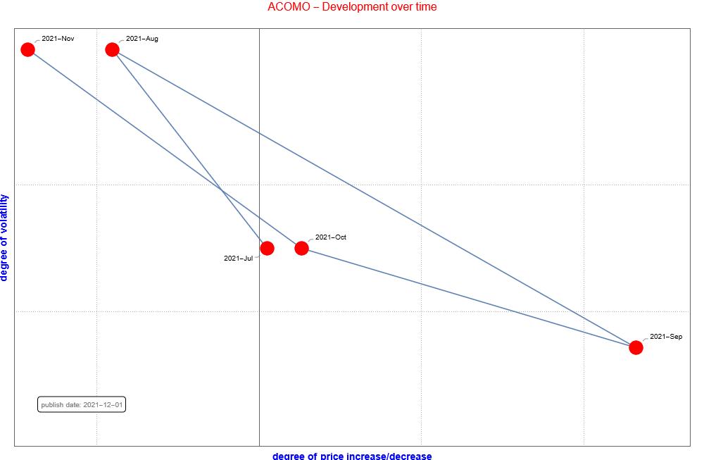
How does ACOMO develop in the past 12 months if we only look at the degree of volatility of the price and price development. By combining both axes to combine four quadrants. Each quadrant is an indication of risk. When a fund is active within a quadrant for a longer period of time, you can anticipate this as an investor.
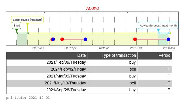
The graph below shows the history of issued buy and sell signals. The light blue part of the graph below shows the signals for the coming month. A red stop is “buy”, a blue dot is “sell”. the red line between buying and selling provides information about how long the ACOMO fund has been in portfolio.
The graph below shows the buy and sell signals given in relation to the price development. In the table below you can see the date that a signal was issued, the type of signal (buy versus sell), whether the signal was issued in the forecast period and the closing price of the stock on that day. The graph below therefore resembles the graph above to a certain extent, only without the forecast.
How does ACOMO develop in the past 12 months if we only look at the degree of volatility of the price and price development. By combining both axes to combine four quadrants. Each quadrant is an indication of risk. When a fund is active within a quadrant for a longer period of time, you can anticipate this as an investor.

The graph below shows the history of issued buy and sell signals. The light blue part of the graph below shows the signals for the coming month. A red stop is “buy”, a blue dot is “sell”. the red line between buying and selling provides information about how long the ACOMO fund has been in portfolio.

The graph below shows the buy and sell signals given in relation to the price development. In the table below you can see the date that a signal was issued, the type of signal (buy versus sell), whether the signal was issued in the forecast period and the closing price of the stock on that day. The graph below therefore resembles the graph above to a certain extent, only without the forecast.
The ASX index is a weighted average of the Small Cap companies whose shares can be traded on the Amsterdam Stock Exchange. It is now interesting to see how ACOMO share compares with the ASX index. In the graph above, we do this by starting both prices at the same level. That is, the price is indexed to “1”.
How well is the Trading Robot doing? For this we make a simulation of 12 months each time. We calculate the return the trading robot would have made if you had followed signals for this fund. And we compare the result with if you act like a passive stock trader. That is, on day one you buy the fund and 365 days you sell the stock.
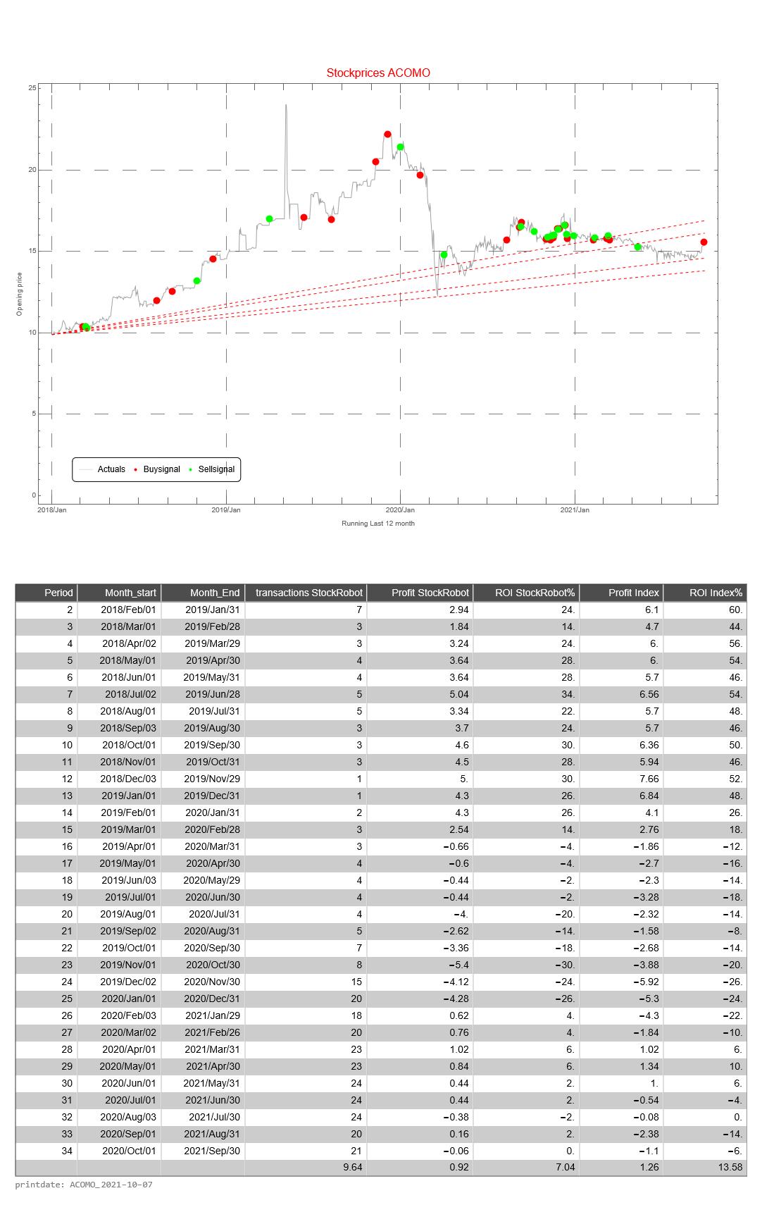
This simulation is repeated 26 times. The difference is that with each subsequent simulation the period shifts by one month. When shifting the 12 months, the simulation only looks at the buy and sell signals from that particular period.
The return of the Trading Robot is calculated as follows.
- a. the difference between the price of the fund between selling and buying (of 1 share of the relevant fund)
- b. we calculate the cumulative difference for multiple buy and sell signals
- c. if there has been no sell signal at the end of the 12-month period, we use the price on the last day of the 12-month period
- d. we calculate the average price value of a buy signal
- e. the cumulative difference divided by the average price is the return over the 12 months
The Profit HR (Trading Robot Profit) is the cumulative difference between buy and sell signals of 1 share of the relevant fund
Profit AEX is the difference in price value between the first and last day of a 12-month period of the relevant fund
The return of the Trading Robot is the Profit AEX divided by the price value of the first day of a 12-months period of the relevant fund
[/su_tab]
[su_tab title=”Banking advice” disabled=”no” anchor=”” url=”” target=”blank” class=””]
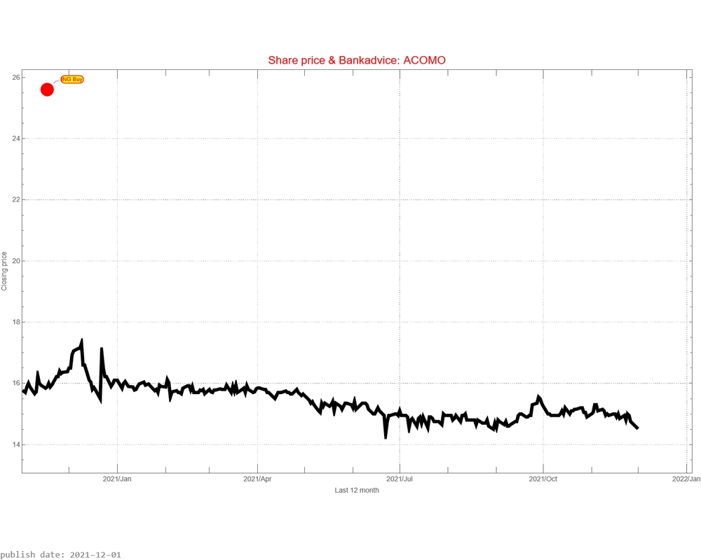
This graph not only shows the price development, but also the various bank advice (buy or sell) and the moment that these advice was issued. The “Red Bullits” are the issued price targets of the issued advice. It is never stated when the intended price targets must be achieved.